Table of contents
Introduction
The Sponsor Dashboard allows the study team to monitor on-demand access to study, country, site and participant-level data.
By using the tabs on the left-hand side, the study team can quickly navigate through the data.
STUDY LEVEL DATA:
At the Study Level, teams can monitor the number of active participants in each period, the overall adherence, as well as more detailed metrics including adherence by study week, adherence category and overall site adherence. Additionally the Top 10 participants with missed, pending or self-report doses are highlighted at the study level.
ACTIVE PARTICIPANTS BY PERIOD:
All participants registered in AICure will be reflected here. Those currently active and those that have been ended in AICure will be categorized appropriately.
OVERALL ADHERENCE:
The adherence for all participants in AICure will be listed here and broken out by the overall adherence as well as the adherence for all visually confirmed doses and the specific adherence over the last seven (7) days. If your study includes more than one period it will be broken out by each period.
ADHERENCE BY STUDY WEEK:
This section allows teams to monitor the specific study adherence from week to week. The percentage (%) is noted on the left y-axis and the corresponding study week on the bottom x-axis. To view additional weeks or amplify specific ones the slide bar beneath the x-axis can be used. Hovering over a study week within the graph will display the specific adherence percentage (%).
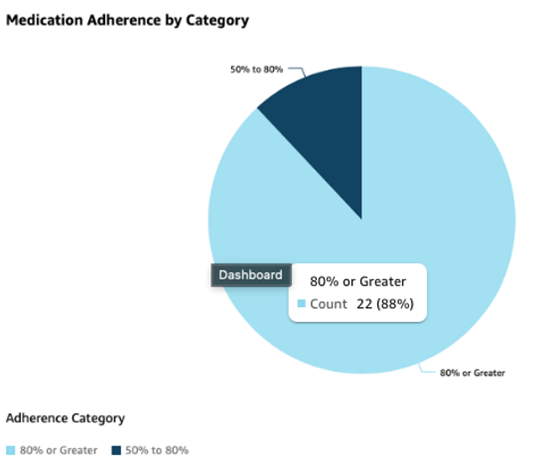
MEDICATION ADHERENCE BY CATEGORY:
AICure uses an 80% or above threshold to determine good adherence metrics. Adherence in the 50%-80% category should be closely monitored and those that fall into the below 50% require increased outreach. Utilizing this section allows the study team to determine the distribution of adherence across the study, while hovering over any slice of the pie chart provides more detail on the number of participants within that adherence range.
STUDY LEVEL DOSE CLASSIFICATION:
Understanding the overall dosing behavior of participants allows the study team to quickly determine good patterns and those that need oversight. This section allows the study team to visually understand the classification of all the different dose types across the study. Hovering over any pie slice will provide additional metrics for each dose classification.
OVERALL ADHERENCE BY SITE:
This section breaks out the adherence at each site across the study as well as the count of participants at each of those sites. The overall adherence percentage (%) is listed on the y-axis with the corresponding site number on the x-axis. Toggling the slides below the x-axis allows a more focused range of view, while hovering over either the adherence bar or participant line graph will display site specific metrics.
TOP 10 ACTIVE PARTICIPANTS WITH MISSED, PENDING OR SELF REPORTED DOSES:
These 3 sections help teams with a quick view of participants that require additional outreach for dosing behavior that is currently impacting medication adherence. Each of these sections highlights the participant ID as well as specific counts and percentage related to the doses in question. A color-coded visual queue is included for any specific dose categories that require escalated follow up.
Back to top
SITE LEVEL DATA:
To monitor data at the site level, users can select the site tab at the left. This selection allows the study team to monitor metrics for each site individually on the Overview tab and it includes additional filters to narrow the data by country, active status or those in the critical window (first 14 days). Teams can also filter the data by participants either in a specific adherence tier or any within a dose hold.
Selecting a specific site will automatically switch to the Details View and provide additional metrics for each site. This view provides additional site info as well as count of participants and adherence both overall and for visually confirmed doses for each applicable period.
Back to top
PARTICIPANT LEVEL DATA:
To monitor data at the participant level, users can select the participant tab at the left. This selection allows the study team to monitor metrics for individual participants. Like the previous section, the Overview tab list all participants in AICure and includes metrics related to adherence as well as days in the study, period and until end of study allowing teams to ensure that participants are progressing through the study as expected. Specific metrics related to the last seven (7) days are also listed for timely monitoring and follow-up as needed.
Selecting a specific participant will automatically switch to the Details View and provide additional metrics for each participant. This view provides specific participant information as well as a summary that includes days and current treatment and regimen as well as a breakout of adherence and dose types overall and for the last seven (7) days.
The Dosing chart provides specific dose information on a day-by-day basis. All expected pills for the day are listed on the y-axis and the specific dose date on the x-axis. Hovering over any specific data point provides the date and specific adherence category.
The Dosing Types pie chart provides the overall dose count for the participant and a breakout by different dose types the participant has completed in AICure.
To monitor dose time variance to ensure that participants are utilizing the alarm time to its maximum benefit the dose time variance graph displays how many minutes from the alarm time the participant completed their dose.
The participants specific adherence for any given week within the study can be monitored using the Adherence by Study Week graph. Hovering over any specific week on the x-axis displays the adherence percentage (%) for that week.
Comments
0 comments
Please sign in to leave a comment.